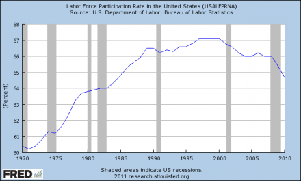
The truth is that the labor force participation rate declined dramatically in January. For those unfamiliar with this statistic, the labor force participation rate is the percentage of working age Americans that are either employed or that are unemployed and considered to be looking for a job.
As you can see from the chart posted below, the labor force participation rate rose steadily between 1970 and 2000. That happened because large numbers of women were entering the labor force for the first time.
The labor force participation rate peaked at a little more then 67 percent in the late 90s. Between 2000 and the start of the recent recession, it declined slightly to about 66 percent.
Since then, it has been dropping like a rock. The chart below does not even include the latest data. In January, the labor force participation rate was only 63.7 percent. That is the lowest that is has been since May 1983. So keep that in mind as you view the chart.
In reality, the percentage of men and women in the United States that would like to have jobs is almost certainly about the same as it was back in 2007 or 2008. There has been no major social change that would cause large numbers of men or women to want to give up their careers. So there is something very, very fishy with this chart....
The federal government has been pretending that millions of unemployed Americans have decided that they simply do not want jobs anymore.
This does not make sense at all.
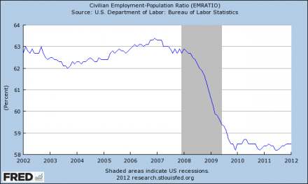
The truth is that unemployment is not really declining at all. The percentage of Americans that are working is not increasing. The civilian employment-population ratio dropped like a rock during 2008 and 2009 and it has held very steady since that time.
In January, the civilian employment-population ratio once again held steady at 58.5 percent. This is about where it has been for most of the last two years....
Does that chart look like an "economic recovery" to you?
Of course not.
If the percentage of people that are employed is about the same as it was two years ago, does that represent an improvement?
Of course not.
If the employment situation in America was getting better, the civilian employment-population ratio would be bouncing back.
We should be thankful that our economy is not free falling like it was during 2008 and 2009, but we also need to understand why things have stabilized.
The federal government is spending money like there is no tomorrow. During 2011, the Obama administration stole an average of about 150 million dollars an hour from our children and our grandchildren and pumped it into the economy. Even though the Obama administration spent that money on a lot of frivolous things, it still got into the pockets of average Americans who in turn went out and spent it on food, gas, clothes and other things.
Without all of this reckless government spending, we would not be able to continue to live way above our means and our economic problems would be a lot worse.
But even with the federal government borrowing and spending unprecedented amount of money, and even with interest rates at record lows, our economy is still deeply struggling. Just consider the following facts....
- New home sales in the United States hit a brand new all-time record low during 2011.
- The average duration of unemployment in America is close to an all-time record high.
- The percentage of Americans living in "extreme poverty" is at an all-time high.
- The number of Americans on food stamps recently hit a new all-time high.
- According to the Census Bureau, an all-time record 49 percent of all Americans live in a home that gets direct monetary benefits from the federal government. Back in 1983, less than a third of all Americans lived in a home that received direct monetary benefits from the federal government.
Yes, things have somewhat stabilized. The percentage of Americans that have jobs is about the same as it was two years ago. Considering how rapidly jobs are being shipped out of the United States, that is a good thing.
Enjoy this false bubble of hope while you can. Things are about to get a lot worse.
Do you remember how rapidly things fell apart after the financial crisis of 2008?
Well, another major financial crisis is on the way. This time it is going to be centered in Europe initially, but it is going to spread all around the globe just like the last one did.
As the charts above show, we have never even come close to recovering from the last recession, and another one is on the way.
So how bad are things going to get after the next wave of the financial crisis hits us?
That is something that we should all be thinking about.


No comments:
Post a Comment